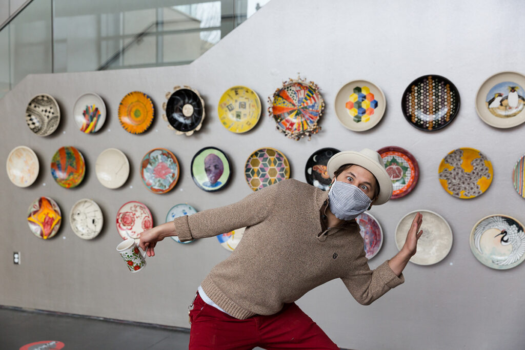
Souper Bowl Platters are here! Bidding has opened online and we wanted to give you a closer look at these beautiful designs. Pick your favorite and bid often!
Each of these platters tells a story. Here are just a few:
Hong Zhang
My donated platter is called ” Hairlines” which inspired by the Kintsugi, a 15 century Japanese technique to repair/fix the broken ceramic cups by applying the gold lines. This ancient tradition means to give a new life to the broken cup. It is like the difficult pandemic time we are facing /experiencing now. We need to fix our problems and make it work and keep going no matter what happened. I also used Chinese fine style ink painting technique to draw some cracked lines on the surface that can be mistakenly seen as a broken plate. I am interested in the relationship between illusion and reality.
Rosa Nussbaum
My platter is sort a souvenir for my piece, “the office of appointments.” I showed an in progress version of it at the Cider Gallery with the Hang12 exhibition in the fall.
Gryffin Eason
Most of my inspiration comes from nature; this piece is an interpretation of the Hyalophora Cecropia moth. I loved the variety of orange, brown, and grey tones in its wings and wanted to create a rich, intricate pattern based on those. Aside from a few rough guidelines, all of my work is symmetrical by eye alone so that the slight variations mimic the inconsistencies of nature. This piece is the culmination of approximately one month of work – a few hours a day, every day. I love that the moth is striking from a distance and becomes more delicate and detailed the closer you look.
Mona Cliff
Anyone who is familiar with my earlier works, this is symbolism I had beaded and have been using in ongoing work, “Dear Heart” the placement of deer horns on an anatomical heart and the ways our hearts are expose and are vulnerable to the world. Yet deer are also symbols of substance and of abundance and sometimes when we make sacrifices with our hearts we are giving life to those around us.
Ling-Lung Chen
In many Asian cultures, the crane is an auspicious symbol signifying peace, purity, prosperity, nobility, and longevity. The crane is highly valued by the Indians, Han Chinese, Tibetans, Mongolians, Koreans and Japanese. The black and white color combination—with red in the Red-Crowned Cranes, and the gracious silhouette, whether still or in motion, reflecting quietly in water, dancing in the snow, or flying through the sky, are breathtaking and heart stopping.
The combination of crane and waves attracts me for reasons beyond the artistic. It illustrates how sentient beings like us perpetuate illusions by creating illusion upon illusion. Waves are just water with no shape, yet we adorn them with curves and more curves. Cranes exist because of their own karma, yet we infuse them with our human hopes and desires to be timeless. Roaming around and around, such is our existence with intriguing flares of illusions like the flying cranes of our hopes and the motionless waves of our lives.
Note: The crane image in this platter is adapted from a Japanese fukusa (gift cover) from early Showa Period (1926-1989), made 1926-1940, collected by the Art Institute of Chicago.
The Souper Bowl is an annual fundraiser that benefits the Adult Education Program and the Ceramics Studio. The funds that we raise through the auction, allow us to purchase essential equipment so we can keep serving the community through art!
Click on the images below for a closer look!
Platters will be on display at the Arts Center starting January 18.
Online bidding begins Jan. 19, and continues through 2pm Saturday, February 5.
Click to bid on platters!